Eat. Drink. Design Awards dominated by Melbourne and Adelaide
One of th emost important events in the hospitality design space is the Eat Drink Design Awards. The World Loves Melbourne was invited to check out the action.
Melbourne and Adelaide venues have taken out the top honours in Australasia’s only hospitality design accolades, the Eat Drink Design Awards.
The winners at a glance:
- ·Best Bar Design – Pink Moon Saloon by Sans-Arc Studio
- ·Best Café Design - Higher Ground by DesignOffice
- ·Best Restaurant Design - Dinner by Heston Blumenthal
- ·Best Identity Design – Pink Moon Saloon by Peculiar Familia
- ·Best Retail Design - Lune Croissanterie by Studio Esteta
- ·Hall of Fame – Il Bacaro designed by Chris Connell Design
Australasia’s best-designed hospitality venues have been named in the annual Eat Drink Design Awards which celebrate design excellence and innovation within restaurants, bars, cafés, nightclubs, retail spaces and temporary venues from across Australia and New Zealand.
In a boom for the southern state, Adelaide is home to both the Best Bar Design and Best Identity Design category winner, the celebrated Pink Moon Saloon. Designed by one of Adelaide’s most dynamic young designers, Sans-Arc Studio, Pink Moon Saloon is a delightfully unexpected space, a ‘cubby house’ snuggled in a laneway in the heart of CBD.
Melbourne was also a big winner, with Higher Ground (designed by DesignOffice) taking out Best Café Design, Dinner by Heston Blumenthal (designed by Bates Smart) awarded Best Restaurant Design and the wonderfully sci-fi Lune Croissanterie (designed by Studio Esteta) for Best Retail Design. The award streak for Melbourne continued with this year’s jury inducting the Italian dining institution Il Bacaro, designed by Chris Connell Design, into the Eat Drink Design Awards’ Hall of Fame.
The annual Eat Drink Design Awards celebrate design excellence within Australian and New Zealand hospitality premises that have opened to the public in the past eighteen months. The Awards provide a unique insight into contemporary Australasian architecture and design - hospitality spaces are often a chance for designers and architects to stretch their more conceptual wings.
Each year, the Eat Drink Design Awards jury features industry leaders from hospitality and design. The 2016 jury comprised of: Hamish Guthrie (interior designer and director of Hecker Guthrie), Adele Winteridge (interior architect and director of Foolscap Studio), Terry Durack (Chief Restaurant Critic, Sydney Morning Herald), Julie Gibbs (food and lifestyle publisher) and Cameron Bruhn (editorial director at Architecture Media).
“Perhaps the most prominent of the characteristics held in common is the overall ambition evident at every level. Regardless of the modesty of means, or the constraints of individual project settings, each and every project that has been commended or received an award sought to boldly ‘punch above its weight’,” said Jury Chairperson, Cameron Bruhn.
“Indeed, some of the most ambitious projects receiving honours have been positioned at the modest end of the budgetary spectrum – Pink Moon Saloon is the prime example, a winner of not one but two categories.”
-FULL DETAILS OF EACH WINNING PROJECT-
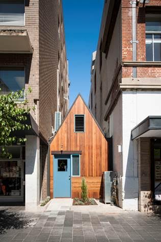
Best Bar Design – Pink Moon Saloon by Sans-Arc Studio, Adelaide, SA
Jury Citation
Pink Moon Saloon is a diminutive venue that occupies a former rubbish bin alley sandwiched between two office buildings in a laneway in central Adelaide. The project is simultaneously audaciously ambitious and modest. It successfully manages to make something from nothing – a forgotten space infused with a feeling of joy that the jury found particularly contagious.
While the design undoubtedly pursues a sense of genuine fun, it also taps into that deep Australian memory of long-forgotten cubby houses and sheds. It is here, within this archetypal connotation, where joyful celebration comes together. Pink Moon Saloon has been executed with a razor-sharp eye on detail and the overall design, while being immediately familiar in some uncanny way, manages to both shock and surprise us – all in a good way.
Capping off all of this, the project is entirely sustainable – the space it occupies can be returned to its former function at any point in the future, and the Saloon relocated to meet a different need. The end result is a bar that fully embraces its actual time and place, which is 2016, and a newly confident Adelaide, respectively.
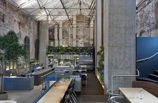
Best Café Design - Higher Ground by DesignOffice, Melbourne, VIC
Jury Citation
Higher Ground is an exceptionally executed exercise in solving logistical challenges while safeguarding the expression of, and respect for, an existing spatial volume, a historic former power station in the western end of Melbourne’s city grid. The design team has shown considerablerestraint in defining the space, creating a host of experiences at different levels (both literally and figuratively), resulting in what the jury has referred to as an “urban drawing room.”
Rather than relying on visual tropes that reflect well-known hospitality types, the resulting space is ambiguous in the way that a high-end hotel’s foyer can be ambiguous. The client refers to this as the ambition to create a “hotel without rooms,” and the desire to make something the likes of which Melbourne has not yet seen. The finished venue is remarkably comfortable and achieves this left-of-field ambition.
Finally, the variety of spaces and “perches” created at different levels in the singular volume allows many opportunities for diners to get comfortable. At the same time, each occupant is rewarded with a different voyeuristic perspective on the gathered crowd, and the experience of a visit is different every time.
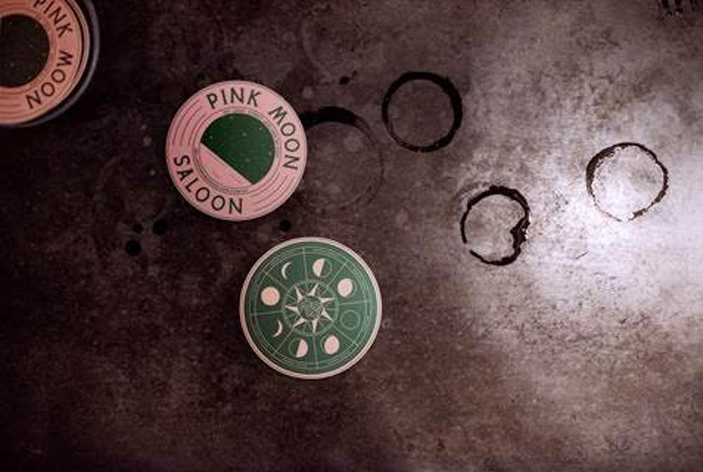
Best Identity Design – Pink Moon Saloon by Peculiar Familia, Adelaide, SA
Jury Citation
The stunning success of Pink Moon Saloon is a result of a fully integrated vision for space, architectural form and visual and graphic identity. From the profoundly simple logo, which is comprised of the archetypal pink moon positioned over an abstraction of the architectural form of the venue, to the use of typography and graphics throughout the venue, the overall impression is of playfulness and lighthearted celebration. The design studio’s quirky stated influences – the US National Parks Service and a Japanese design sensibility – are discernible, but ultimately they have been transcended in the final product.
At a time when “joy” is a hard quality to find, Pink Moon Saloon dishes it up in spades. The use of graphics is innovative yet deceptively simple and direct. Perhaps most importantly, the project is infused with a sense of happiness and cheeky fun that won the jury over. Considering the modest budget, the scope of the project’s ambition is truly breathtaking. The design team has taken a great risk here, with minimal resources, and it has paid off.
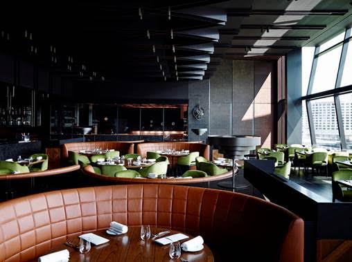
Best Restaurant Design - Dinner by Heston Blumenthal by Bates Smart, Southbank, VIC
Jury Citation
We can summarise the essence of Dinner by Heston Blumenthal in one word: sumptuous.
This is an interior that perfectly reflects the ambition of the venue and the chef himself – to transport the diner through a curated experience, one that is simultaneously calm yet exciting. Blumenthal wants everything to be an adventure, but one that engages the diner with comfort: the design of the interior supports this absolutely.
Eschewing the brittle formality that can accompany the high-end gastronomic experience, everything about this interior is “squishy” – to use an oddly non-designer-like word – you sink into the deep comfort of this interior, both literally and conceptually.
The experience begins with the entry, a dark and lusciously finished hall that physically transports you away from the “everyday” and deeper into the interior’s embrace. The dining room, and even the kitchen, are all tailored to emphasize the fact that you are somewhere special, and that special things are about to happen. The result is a heavily curated experience and interior that is equal parts theatrical and delightful.
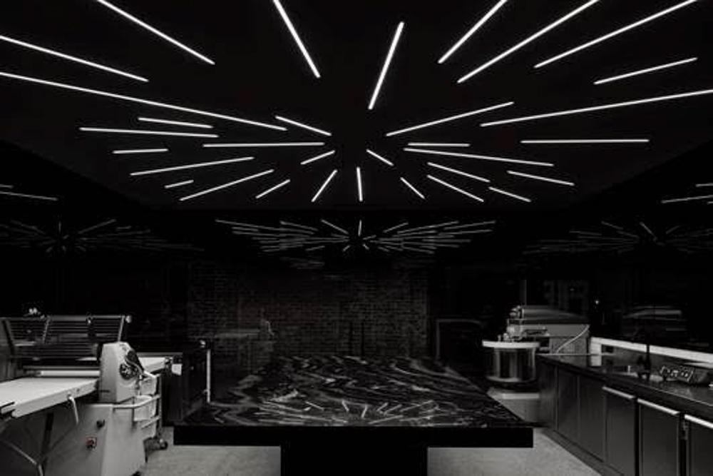
Best Retail Design - Lune Croissanterie by Studio Esteta, Fitzroy, VIC
Jury Citation
Lune Croissanterie is many things all at once: an experience, an event, a showroom for goods, even a shrine complete with altar, all to the greater glory of one thing: the croissant. Taking the concept of laser-focused purpose to a new, higher level, Lune Croissanterie perfectly showcases the prodigious talents required to create this one type of pastry, along with various variations on the core retail theme.
The act of creating and selling what The New York Times has referred to as arguablythe “world’s best croissant” has been given a similarly focused and exceptional interior, where the visitor is stepped through the process of ordering and purchasing as if through a religious observance. As with a religious ritual, the design of the interior is shaped to provide the props, sets and spatial sequences and halting points of human movement that interpret that experience.
Referred to by one juror as the “Apple Store of croissants,” the interior perfectly manifests the concept of experiential retail and takes it to an almost obsessive, higher level. The result is “self-confident yet fabulous,” and yet it would all be for nought if the product itself were not up to scratch. Fortunately, there are no problems on that front.
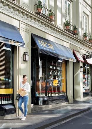
Hall of Fame – Il Bacaro designed by Chris Connell Design, Melbourne CBD, VIC
Jury Reflection
In an industry that seems to mow through its own ranks on a regular basis, subjecting itself to constant churn and renewal, Il Bacaro is a hospitality survivor and an institution. It is the quintessential example of that particular but rare Melbourne species: the classic, timeless, character-filled Italian dining interior, and it continues to please critics and the public alike. In fact, on Il Bacaro’s twentieth anniversary last year, a reviewer for Australian Gourmet Traveller half-jokingly noted that the restaurant might just qualify for heritage listing.
Opened in 1995, Il Bacaro was an important early work for designer Chris Connell and followed an earlier project with Il Bacaro’s founder Maurizio Terzini, the equally iconic Caffe e Cucina in South Yarra. While Caffe e Cucina was a casual, morning kind of place, Il Bacaro was a more sophisticated, and perhaps slightly more formal proposition: dark and atmospheric and geared to lunch and night-time fine dining.
When asked what makes this particular restaurant such an enduring classic, Connell is circumspect, or perhaps merely realistic, about the role of the interior, and indeed design in general. It is more than modesty that compels him to name the product on offer, and the service provided – the details of the way they serve and present food and the high quality of the food itself – as central to the experience of Il Bacaro, and indeed any exceptional restaurant. It is primarily the consistency of these things, he suggests, rather than design that has made Il Bacaro such an important landmark in the broad landscape of Melbourne dining. In Connell’s own words, it was and remains his role to merely “provide a vehicle” for these things to occur.
Terzini brought to the project a crystal clear vision for Il Bacaro in terms of service, product and atmosphere. Connell recalls Terzini previously turning up at Caffe e Cucina, and inevitably yet imperceptibly adjusting the level of illumination, or the angle of a knife or fork on a table. From the beginning, he was all about getting the details right, an attitude he shared with Connell. This approach to quality and consistency underpinned the brief for Il Bacaro, and subsequent chefs and owners have maintained this high standard.
Within the constraints of such a clear starting brief, Connell and his team had a myriad of technical and logistical problems to solve. The space itself is quite small, with very little room for storage, kitchen and back-of-house functions. Matching the seating capacity of the venue to the serving capacity of the kitchen in such a tight space posed a challenge, as did the provision of storage. Connell turned this latter constraint into a virtue, particularly with the storage and display of wine in purpose-designed racks that give the venue such a distinctive visual signature.
Other places, such as the otherwise lost space beneath the banquette, are also used for wine and other storage; in Connell’s own words, “every millimetre counted.”
Finished in a palette that includes dark timber panelling and surplus Vitrolite glass panels from the 1930s, the dining space, while modest in size, offers a range of different dining experiences. Connell calls this “zones within zones.” They range from the stool seating at the bar, to zones of linen cloth-covered tables with classic timber cafe chairs, and more tables against the banquette. The finished venue is quite inward-looking, with views to and from the exterior obscured by dark timber venetian blinds, which serve to intensify the atmosphere and the sense of drama and theatre within.
Ultimately Connell is a designer who sees restaurant interior design as just “part of the package, not the drawcard.” This attitude, and indeed the irrefutable evidence of the ongoing relevance of Il Bacaro, can be favourably compared to the rock star chef and million-dollar-fitouts seen emerging over the last twenty years. The latest trends, and venues, come and go (“How the hell would I know what the latest colour is?” quips Connell in our interview) but both Il Bacaro, and the philosophy by which it was created, remain. Long may it be so.
